Creating a home with lasting appeal does not mean avoiding new ideas. It means choosing materials and patterns that continue to work even as furniture, colors, and personal tastes change. Color, design, pattern, shape, and texture all come together to create a tile that is truly timeless. The most enduring tile choices often have an instantly recognizable design character, whether it is the contrasting squares of a checkerboard floor or the grain and texture of handmade-look tile.
For a home that feels current without being tied to a short-lived trend, it helps to look beyond plain square tiles and familiar subway layouts. Here are six timeless tile ideas worth considering, each offering a different way to give an interior more personality.
Terrazzo Tiles: A Touch of Nostalgia
Terrazzo is perhaps the first thing that comes to mind when one thinks of tiles. Known for its small fragments of stone or other material scattered across a sturdy base, the tile has a strong nostalgic appeal.
While terrazzo has been used for decades, it is far from being dated. Depending on the design and material, the flecks of the tile can be subtle and closely matched to the base color, or large and contrasting enough to create a more graphic effect.
The size and colors of the fragments can give a terrazzo tile its defining character. For instance, finer fragments create a more uniform and traditional look that appears consistent from a distance. Larger chips fit better in contemporary designs, with their chips becoming a part of the design itself. Large chips can be particularly effective when used for expansive installations and large surfaces.
Versatile Neutral Palettes
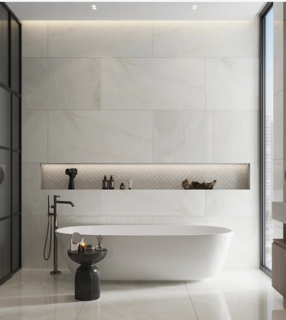
Neutral tiles offer more scope for experimentation than their understated colors might suggest. Neutral shades are not boring or ‘plain’; in fact, some of the highest-quality marble in the world is available in neutral shades such as ivory, cream, and gray. Neutral shades such as white, beige, cream, gray, and others can be made exciting by pairing them with different shades, patterns, and surface finishes.
Tiles that complement any style often feature simple shapes and neutral patterns. This is why they can be paired with numerous other designs. Pairing neutral tiles with terrazzo, travertine, marble, decorative, and textured tiles can help create a detailed, defining surface in your home.
Neutral tiles also offer flexibility when other elements in a room change over time. Furniture, artwork, cabinetry, and fabrics can introduce new colors without clashing with the main surfaces.
Star and Cross Tiles for A Mesmerising Motif
Another traditional design motif that has been used in architecture and interior decor for centuries, the star and cross pattern creates a striking ornate look through the interlocking of its titular shapes. When paired together, these star and cross tiles form an intricate, repeating design that feels a lot more distinctive than plain surfaces.
Different color combinations can be used to create different effects with the star and cross tile pattern. Combining beige with charcoal provides a dramatic contrast, while terracotta with cream presents a uniform, warm look. A gray-and-white palette can keep the pattern restrained while allowing its interlocking shapes to remain noticeable.
While a historical pattern, this geometric design does not need to be limited to just traditional designs and vintage homes. Simple cabinetry, clean-lined furniture, and understated wall colors can give the pattern a fresh context, making it fit perfectly even in an otherwise minimalist decor.
Classic Contrast with Checkerboard Tiles
Checkerboard is an instantly recognizable pattern, known for its bold yet refined contrast. While traditionally the checkerboard pattern is known for exquisite black and white marble floors, the same pattern can assume a completely different personality when the colors are replaced with other options. Cream and terracotta create a softer, old-world feel, while sage green and ivory offer a quieter alternative. Charcoal and pale gray provide contrast without the sharpness of pure black and white.
Beyond colors, the size of the grid can also affect the overall decorative effect of the checkerboard tile. For instance, larger grids provide a bold and architectural appearance while smaller squares can add visual movement and depth across walls. Setting the pattern diagonally can make it feel more dynamic than a conventional grid.
A checkerboard floor already has a strong visual pattern, so plain cabinetry, understated furniture, or solid-colored walls allow it to remain the main feature. It is a way to bring a classic motif into a contemporary home without recreating a period interior.
Petite and Pretty Penny Round Tiles
Penny round tiles, with their small circular shapes, offer a different alternative to the straight lines of square and rectangular formats. The repeated circles create a soft, almost dotted pattern that can look playful, vintage-inspired, or surprisingly restrained depending on the color. This versatility allows them to be used in a wide range of creative interior design ideas, both traditional and modern.
White penny rounds with pale grout produce a subtle surface, while black grout makes every circle more distinct. A single-color arrangement in blue, green, or charcoal can feel more graphic without needing a second shade. For a bolder design, two colors can be arranged in bands or simple motifs.
Penny rounds are worth considering for anyone who likes the character of mosaic tile but wants something different from conventional square pieces. Their repeating geometry adds texture while remaining recognizable at a glance.
Zellige: A Remarkable Design
Zellige tiles have a long history in decorative architecture, and their appeal comes partly from the irregularities that distinguish them from more uniform surfaces. Their slightly irregular surfaces, uneven edges, and variations in glaze create a wall that looks different as daylight shifts. Even when every tile belongs to the same color family, subtle differences in reflection keep the surface from appearing the same.
From pale palettes to dark shades, zellige tiles are an excellent choice for modern homes. White and cream zellige tiles offer more texture than a perfectly smooth white wall, while deep green, ink blue, and earthy brown versions create a stronger focal point. The effect is particularly striking when a glossy glaze catches light across a kitchen backsplash, fireplace surround, or bathroom wall.
Pairing zellige with simple stone, timber, or painted surfaces gives its uneven glaze room to show. For anyone who likes understated interiors but finds flat finishes a little lifeless, zellige is worth exploring.
Choosing a Design That Stays
A tile does not need to be plain to remain relevant, nor does a decorative design automatically feel dated. Checkerboard, terrazzo, zellige, penny rounds, and patterned tiles each have a distinct identity. Their lasting appeal comes from the way their shape, surface, and arrangement work together.
The most successful tile choices are specific rather than generic. Choosing one for a clear reason makes it easier to build an interior around it, creating a look with personality that does not depend on the latest trend.